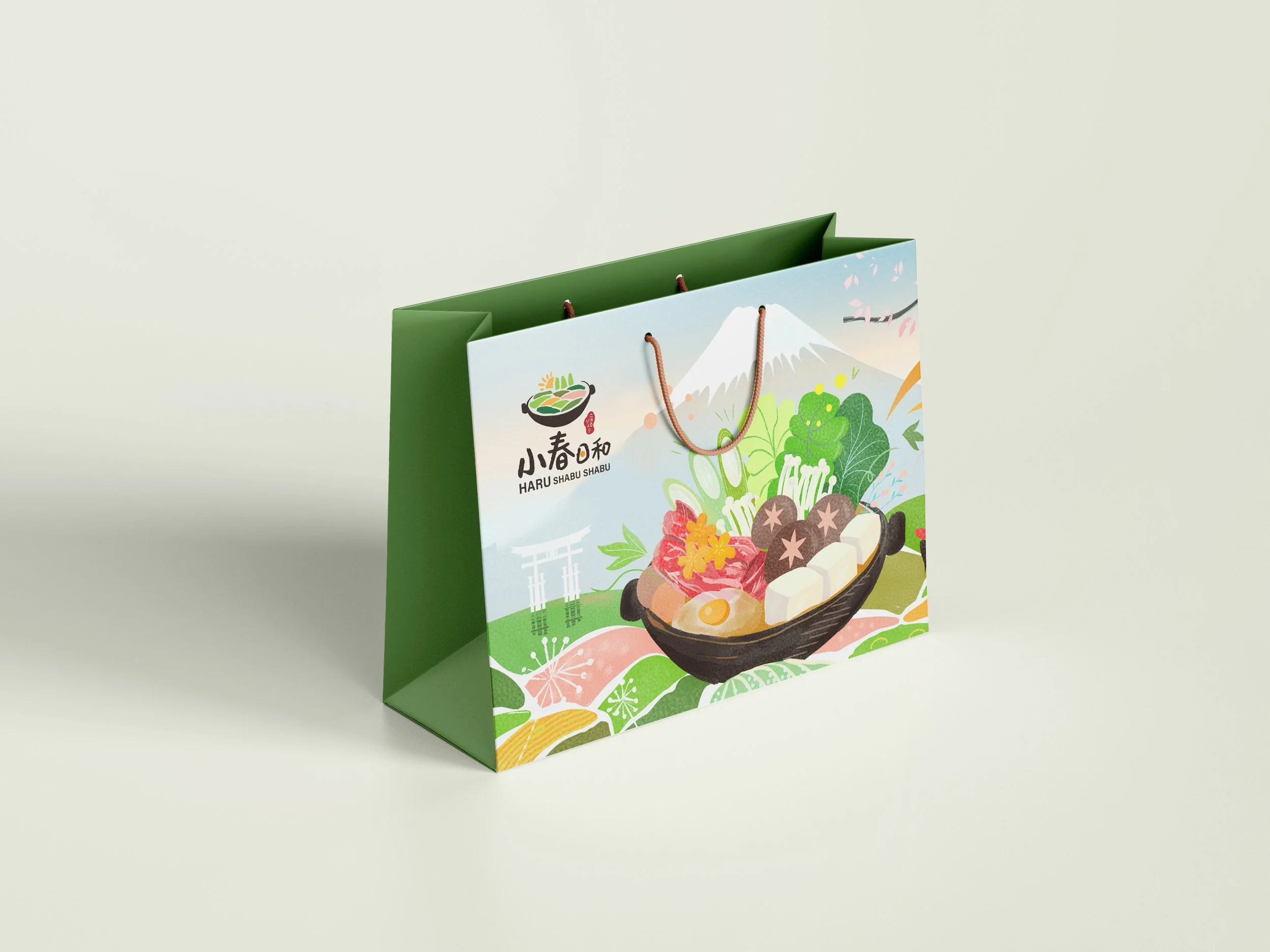
Branding of a Japanese hot pot restaurant in Toronto
Client Name: Haru Shabu Shabu
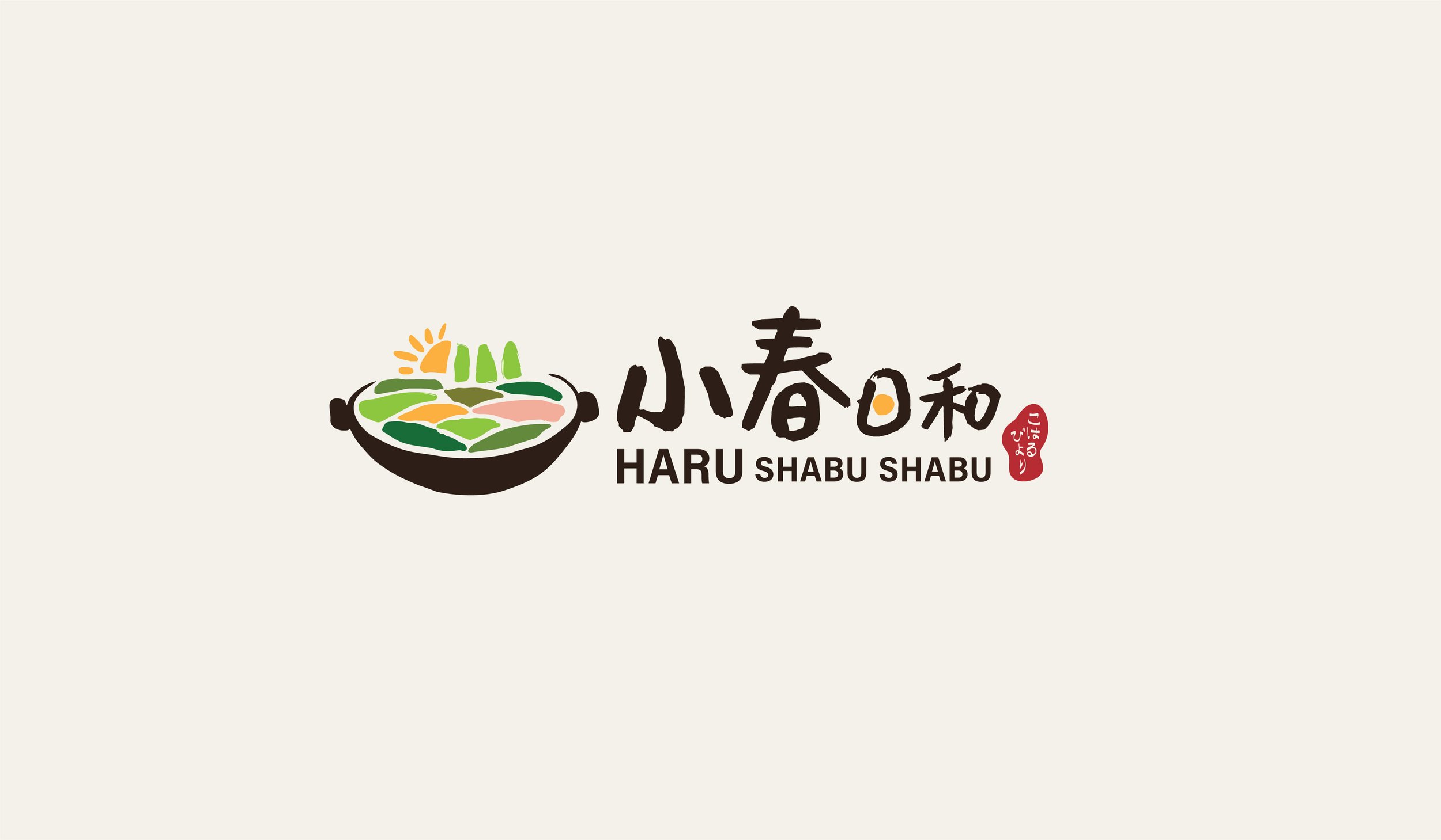
Haru Shabu Shabu is a all-you-can-eat Japanese hot pot restaurant in Toronto. In Japanese, “haru” means spring, and “shabu shabu” the swishing sound of food cooking in the pot. The client wanted a logo for this new restaurant that highlights its flavourful broths and fresh ingredients of the season.
My Role: Brand Designer
Art Direction
Logo | Concept | Brand Identity | Illustrations
Touchpoints
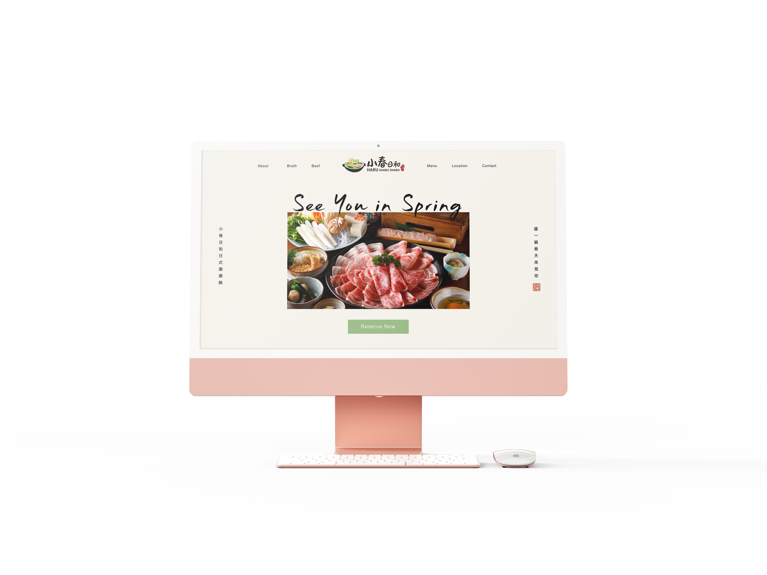
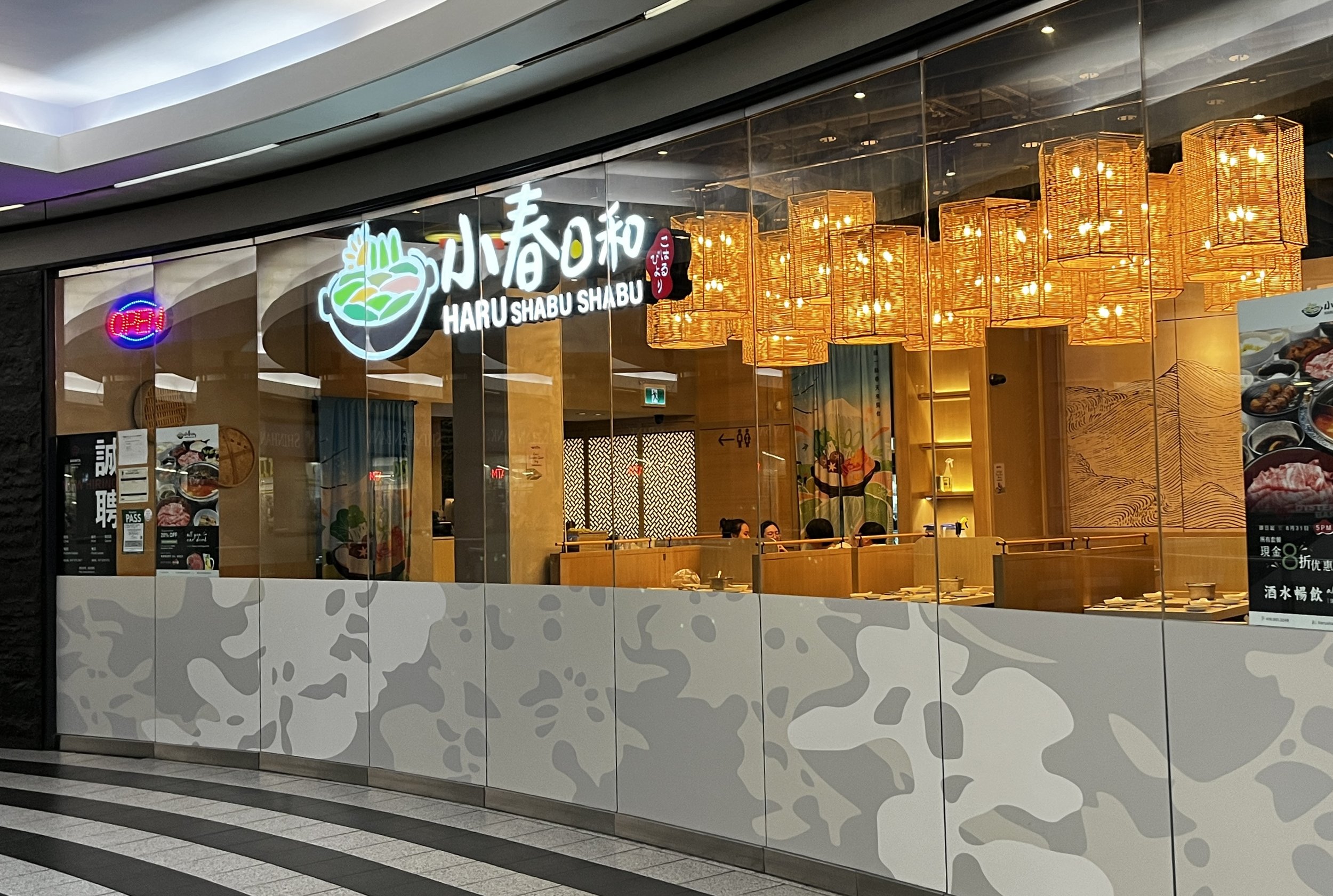
Signage | Digital Menu | Business Card | Website Design & Prototype
You can view the live website here.


